Reading a Paper over a Cup of Coffee

Frequentist Thinking I − Reading a Paper over a Cup of Coffee
Keywords: clinical trial, language & writing, p-value, survival & competing risks
A daughter is taking her first steps into research, and her father is a statistician. After advising her to refine her research question into “PECO,” the daughter—a clinician—decides to study the relationship between having a stoma and returning to work among cancer survivors. These coffee-chat dialogues blend story, methods, and ways of thinking—sometimes practical, sometimes abstract—sometimes with a quiz and small R scripts you can rerun.
Making sense of the numbers around survival curves
Dad: “Hmm? It’s getting cold—what are you still reading this late? Want me to make some coffee?”
Daughter: “Oh—thanks, Dad. Milk too, please. I’m reading a paper on gastric cancer surgery. Hey, you once explained the difference between overall survival (OS) and disease-free survival (DFS), right?”
Dad: “That does ring a bell.”
Daughter: “Do you read clinical papers for work, too?”
Dad: “Sometimes. I work as a trial statistician, so yes. But more often I’m on the writing side of papers. And I don’t really need the latest clinical details for my day-to-day work.”
Daughter: “Good. Because there are details in this paper that I don’t understand—especially the words that feel ‘statistical.’ Look at this figure. It’s from a randomized trial comparing surgical approaches for gastric cancer, called JCOG9502 (Sasako et al. 2006). The TH group received the standard procedure—approaching the lower mediastinum from a laparotomy incision. The LTA group underwent lower mediastinal dissection as well, through a continuous left thoracoabdominal incision.”
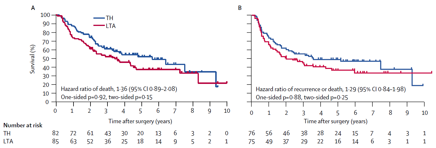
Dad: “This is what people call a Kaplan-Meier curve. Panel A is OS, and Panel B is DFS. In both panels, the TH group (the blue curve) sits above the LTA group (the red curve). That means the TH group had better outcomes.”
Daughter: “That part I get. It’s the small details I’m stuck on. The first thing that tripped me up was the number at risk under the curves. That’s the number of patients still under observation at each time point, right? Look at the numbers at time zero. In Panel A it’s 82 and 85, but in Panel B it’s 76 and 75. The sample sizes differ between the two analyses. Do you know why?”
Dad: “That’s a hard one. In a randomized trial, excluding patients from the analysis usually means something serious—like a major protocol deviation. Can I get a refill?…Hmm. To analyze DFS, you need to be able to ascertain whether relapse occurred. Is there any reason why that might not be assessable for some patients?”
Daughter: “Right—if the tumor wasn’t completely resected, maybe they didn’t treat it as ‘relapse’ in the DFS definition. Let me check… The paper says there were 151 patients who had an R0 resection. That’s probably part of it. And another thing: after about 7 year, the number at risk drops to just a handful of patients. What do you make of that?”
Dad: “That depends. How long was accrual, and how long was follow-up?”
Daughter: “Accrual was from 1995 to 2003—8 years. And it says survival data up to 2006 were analyzed. So the minimum follow-up is around 3 years, maybe.”
Dad: “Then not everyone can be followed for more than 3 years, right? We talked before about censoring. Time-to-event data consists of events and censoring. Having a lot of censoring within the first 3 years would be suspicious—but censoring after 3 years can simply reflect the planned end of follow-up.”
Daughter: “But papers don’t tell you when censoring happened, do they?”
Dad: “They do. See those little tick marks on the curve.”
Daughter: “These tiny spikes?”
Dad: “Yes. Those marks indicate censoring. If you saw many tick marks right after time zero, what would you suspect? It would mean patients were lost to follow-up soon after the study began—so they were censored early. That kind of pattern can hint at bias.”
Daughter: “In this figure, there are only a few tick marks within 3 years. So most patients were followed for at least three years. That sounds like a well-run study. Let me summarize what we just said—something like this?”
- The number at risk shows how many people remain under observation at each time point.
- Tick marks indicate censoring.
- The figure doesn’t show everything; you should also check the accrual period and planned follow-up.
Daughter: “But textbooks don’t teach you this kind of thing. They’re all means and regression coefficients.”
Dad: “Survival analysis tends to be pushed to the back of many general statistics textbooks. If you want to learn how cancer clinical trial data are actually analyzed, a clinical trials textbook written by statisticians from the U.S. cooperative group SWOG is often more useful than a general statistics text (Green et al. 2013).”
Daughter: “Come to think of it, it took more than ten years to produce this figure. The staff must have worked incredibly hard. By the way—last time we talked about trial protocols. You submit the protocol to each site’s ethics committee, right? And once it’s approved, you basically don’t change it—because changing it means paperwork.”
Dad: “That’s right.”
Daughter: “It’s scary, putting a plan into words while looking ten years ahead—without even knowing who will read it. And more than a hundred patients are involved. I can see why you’d want to pin down what each endpoint means, even at the level of wording. Oh—and about English terms around survival curves: how would you say ‘hazard ratio,’ ‘95% CI,’ ‘one-sided p,’ and ‘two-sided p’ in Japanese?”
Dad: “Usually: hazard ratio, 95% confidence interval, one-sided p-value, and two-sided p-value—basically loanwords with standard Japanese phrasing. These are classic survival-analysis outputs. Hazard ratios and p-values often come from Cox regression, but we can talk about that properly another day—when we have time.”
To explain prognosis, clinicians sometimes talk about “life expectancy” or remaining lifetime. Can you read “life expectancy after gastric cancer surgery” from the JCOG9502 figure?
- You can read it from Panel A (the OS Kaplan-Meier curve).
- You can read it from Panel B (the DFS Kaplan-Meier curve).
- You cannot read it from either Panel A or Panel B.
- The correct answer is 1.
To summarize survival time, people use the mean or the median, but the median survival time is easier to read from a figure.
Survival time is numerical (measured in days or years), so it behaves like continuous data in many respects. For continuous data, the median is the value corresponding to the top 50%, right? Once at least half of participants experience the event—so their survival times are “observed”—you can estimate the median survival time even in the presence of censoring.
Concretely, the median survival time corresponds to the time when survival reaches 50%—that is, the point where the OS Kaplan-Meier curve in Panel A falls to 50%. You simply read off the time at which the curve crosses that level.
Reference
Green J, Benedetti J, Smith A, Crowley J. Clinical Trials in Oncology. Boca Raton: CRC Press; 2012
Sasako M, Sano T, Yamamoto S, Sairenji M, Arai K, Kinoshita T, Nashimoto A, Hiratsuka M, Japan Clinical Oncology Group (JCOG9502). Left thoracoabdominal approach versus abdominal-transhiatal approach for gastric cancer of the cardia or subcardia: a randomised controlled trial. Lancet Oncol 2006;7(8):644-51
Next episode and R script
Episodes in this series
- Reading a Paper over a Cup of Coffee
- P-Value Explanations That Seem Plausible at First Glance
- Beyond 0.05: Interpreting P-Values in a Clinical Trial
Earlier series
Glossary