Coffee and Research
  • Home
  • cifmodeling
  • A Conversation on Causality at Our Table (EN)
    • Index
    • Study design
  • A Conversation on Causality at Our Table (JP)
    • Index
    • Study design

On this page

  • Study Design II − Data Have Types
    • Four types of data items
    • Reference
    • Episodes, glossary, and R-script

Data Have Types: A Coffee-Chat Guide to R Functions for Common Outcomes

This post is part of a long-form series on how clinicians learn research and statistics, told through conversations over coffee. In this episode, a clinician daughter and her statistician father build a practical mental map from outcome types (continuous, binary, count, survival) to probability models and common R functions such as ggplot() and cifplot(). This article can be read on its own and serves as a gentle entry point to the series.
Published

December 14, 2025

Study Design II − Data Have Types

Keywords: probability model, R simulation, survival & competing risks, language & writing


This post is the second episode of my Story and Quiz series. Over a cup of coffee, a clinician daughter and her statistician father build a rough mental map from data types (continuous, binary, count, survival) to common R functions: mean(), t.test(), glm(), fisher.test(), survfit(), and cifplot(). We simulate a small stoma-surgery dataset in R, look at histograms, tables, and survival curves, and end with a short quiz about oncology endpoints and FDA approvals. If you’d like to start from the beginning, you can find the first episode here:

Study Design I − A Story of Coffee Chat and Research Hypothesis Hypothesis

Four types of data items

Me: “Okay, coffee’s ready. Can I keep you a bit longer—just a bit?”

Dad: “If coffee is involved, yes. A warm cup is perfect now that the air’s turning autumn-like.”

Me: “You said something earlier that stuck with me: the R function we use depends on the outcome. I didn’t really get that part. In my head, data are just…numbers? What’s there to distinguish?”

Dad: “They’re all numbers, yes. But for statistics, the type of data matters more than people expect.”

  • Continuous data
  • Binary / categorical data
  • Count data
  • Survival data

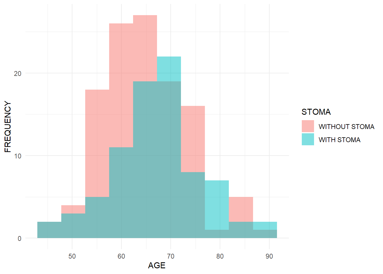
Me: “Continuous data are things we measure, right? Like age or blood pressure. Binary data I get — like ‘with stoma’ vs ‘without stoma’ in my survey.”

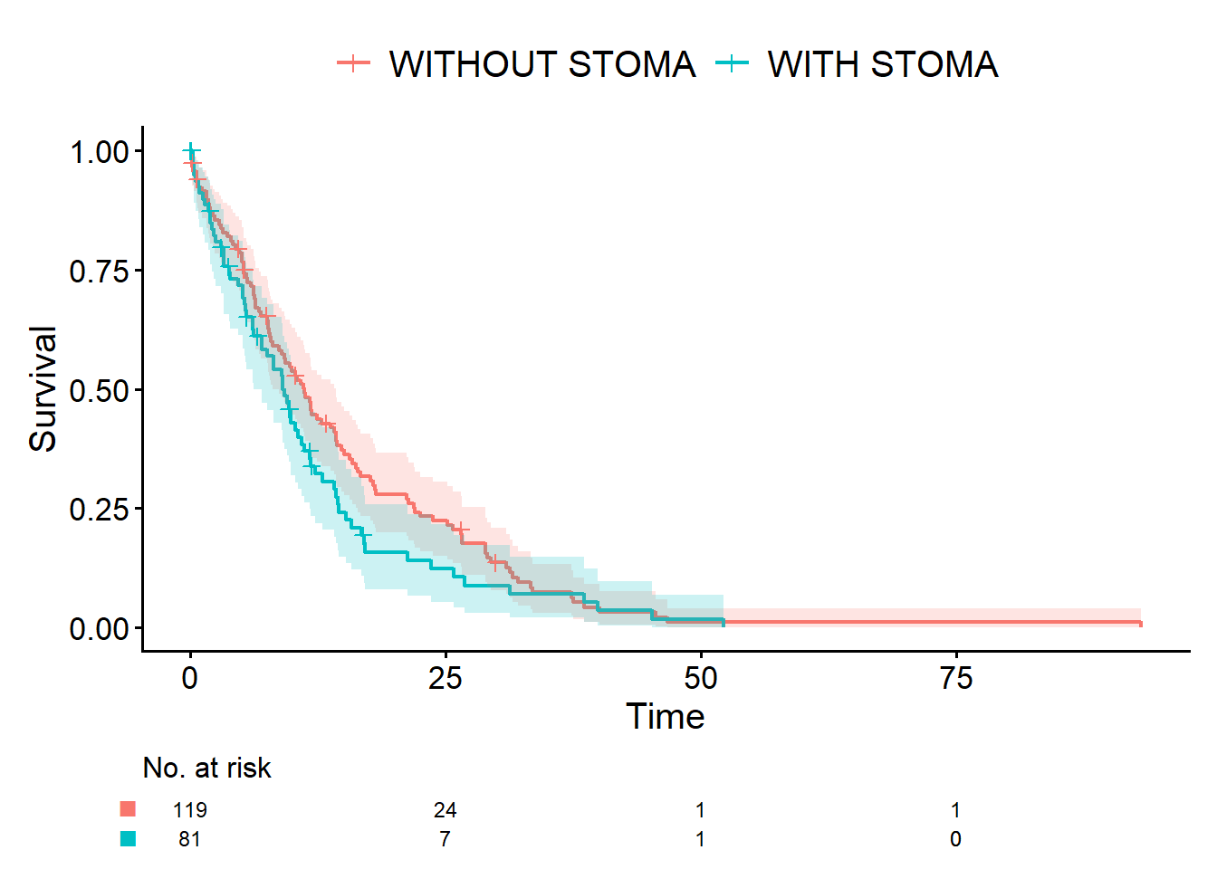
Dad: “Perfect. Count data is when you literally count events, like the number of traffic accidents. Survival data is things like lifespan — time from some starting point until an event, such as death. In your case, that could be time from surgery to returning to work, or time to relapse.”

Me: “When you say it like that, they definitely feel like different beasts. But in the R course I took, we just typed whatever they put on the slides — t.test(), glm(), survfit(), all those things felt like magic spells.”

Dad: “That’s a common side effect of R lectures. Do you have your laptop?”

Me: “…Wait, what?”

Dad: “Your laptop. You brought it, didn’t you? Let’s install RStudio.”

Me: “…Well, I did ask for help, so fine.”

Dad: “In R, for continuous data you often use functions like mean() or t.test().”

Me: “Okay…”

Dad: “To summarize binary data you can use table(). For p-values, fisher.test(). For more complex analyses, regression models like glm(family = binomial). For survival data, you’ll see functions like survfit(), coxph(), and cifplot().”

Me: “There is no way I can memorize all that. In class I just typed whatever they put on the slides. Those functions are basically incantations to me.”

Dad: “You don’t need to memorize them—not all at once, at least.”

Me: “Wait, I don’t?”

Dad: “What matters is being able to picture which functions belong to which type of data. Or even better, imagining which probability distribution is being assumed.”

Me: “Probability distribution?”

Dad: “You learned this as an undergrad, didn’t you? You’ve heard of the normal distribution — and binomial distribution?”

Me: “At least that one, yes.”

Dad: “Almost any statistical method beyond simple description rests on some kind of probability model. Normal distributions for continuous data, binomial distributions for binary data, Poisson distributions for count data. For survival data, there isn’t a single standard model, but the simplest is the exponential distribution. You don’t have to remember the formulas, just the general matching.”

Me: “So it’s more about rough matching than exact formulas.”

  • continuous: normal-ish
  • yes/no: binomial-ish
  • counts: Poisson-ish
  • survival: nonparametric

Me: “I don’t know Poisson and exponential. Aren’t those basically curse words?”

Dad: “Yeah, I agree it doesn’t sound like something humans would use. Statistical terms are often the hardest part. If a word ever feels unclear, feel free to come back to it anytime. Anyway, the key is to learn the patterns—which probability model to use for which data type.”

Me: “Uh-huh. And what does that have to do with R?”

Dad: “Quite a lot. I really want you to remember this, there are two common measures: proportions and rates. We use them all the time, like ‘traffic accident rates’. But in everyday language we don’t distinguish them clearly. In statistics, though, a proportion is the parameter of a binomial distribution, and a rate is the parameter of a Poisson distribution.”

Me: “Proportions and rates… aren’t they basically the same thing? I’ve never really distinguished them.”

Dad: “No, they’re not. A proportion is usually a percentage, say, ‘60% of patients are women’. But consider ‘the annual traffic accident rate in Tokyo’. You wouldn’t naturally express that as a percentage. You’re counting events and dividing by person-time or by years.”

Me: “Hmm…go on, professor.”

Dad: “You don’t need rigid textbook definitions. It’s enough if your brain can think: ‘This looks like continuous data, probably close to a normal distribution, then you’ll use functions in this area,’ or ‘This is 0/1 data, so you’ll look for binomial-type functions.’ If you can connect data types and distributions, R functions become much easier to recall.”

Me: “I see. So if I imagine the data type and its distribution, I don’t have to memorize R functions by brute force. That does sound efficient.”

Dad: “Exactly. Once you have that mental image, when you later read manuals or books, you’ll think, ‘Oh, this is that thing I was imagining,’ and everything clicks together. Okay, let me show you a quick demo in R. We’ll simulate age (continuous), sex and stoma status (binary), and survival time, and run simple analyses. We will use the normal distribution, binomial distribution, and exponential distribution.”

Me: “There it is again, the spell-casting.”

Dad: “Pretty much. For now, type library(ggplot2) and library(cifmodeling). I’ll show you a histogram and Kaplan-Meier curves.”

Me: “Fine. I’ll type them with my brain temporarily switched off. That’s how I survived my R class anyway.”

Dad: “Don’t turn your brain off while I’m teaching you. When you add features to R, you use install.packages() and library(). install.packages() installs a package onto your computer, and library() loads that installed package so you can use it.”

Me: “Got it. That actually clears things up a lot. I really did think I had to install it every single time.”

Dad: “Installing every time is like buying coffee beans every time you brew coffee. No one does that. You buy the beans once and just grind when you drink.”

Generating simulated data

Here we’ll use R to create a simple dataset and run basic analyses for continuous, binary, and survival data. The theme is a two-group comparison: patients with and without a stoma.

  • Age: continuous, from a normal distribution using rnorm()

  • Sex, stoma: binary, from a binomial distribution using rbinom()

  • Survival time: from an exponential distribution using rexp()

R code and output
set.seed(46)

# Stoma: 1 = with stoma, 0 = without stoma
stoma <- rbinom(200, size = 1, prob = 0.4)

# Sex: 0 = WOMAN, 1 = MAN
sex <- rbinom(200, size = 1, prob = 0.5)

# Age: normal distribution (stoma group slightly older)
age <- rnorm(200, mean = 65 + 3 * stoma, sd = 8)

# Survival time: exponential distribution
#   expected survival 10 years (with stoma) vs 15 years (without)
hazard <- ifelse(stoma == 1, 1 / 10, 1 / 15)
time   <- rexp(200, rate = hazard)

# Random censoring: 0 = censored, 1 = event
status <- rbinom(200, size = 1, prob = 0.9)

dat <- data.frame(
  age    = age,
  sex    = factor(sex, levels = c(0, 1), labels = c("WOMAN", "MAN")),
  stoma  = factor(stoma, levels = c(0, 1),
                  labels = c("WITHOUT STOMA", "WITH STOMA")),
  time   = time,
  status = status
)

head(dat)
       age   sex         stoma      time status
1 59.19077 WOMAN WITHOUT STOMA 17.939751      1
2 59.46486   MAN WITHOUT STOMA 18.189251      1
3 55.34491   MAN WITHOUT STOMA  2.445121      1
4 60.68207   MAN WITHOUT STOMA 46.737429      1
5 61.79577   MAN WITHOUT STOMA  0.149128      1
6 62.84530 WOMAN    WITH STOMA  0.298167      1
Summarizing continuous and binary data

First, let’s describe age and sex in the stoma vs non-stoma groups using a histogram and contingency table. You should see that the age distribution for the stoma group is slightly shifted to the right (older on average), because that’s how we simulated it.

R code and output
# install.packages("ggplot2") # if needed
library(ggplot2)

ggplot(dat, aes(x = age, fill = stoma)) +
geom_histogram(alpha = 0.5, position = "identity", bins = 10) +
labs(x = "AGE", y = "FREQUENCY", fill = "STOMA") +
theme_minimal()

table(STOMA = dat$stoma, SEX = dat$sex)
               SEX
STOMA           WOMAN MAN
  WITHOUT STOMA    43  76
  WITH STOMA       44  37
Summarizing survival data with survival curves

For survival data, we want to describe how long patients survive without the event. Here we use cifplot() from the cifmodeling package to draw the Kaplan-Meier curves. Event(time, status) tells R which variables represent the time and event indicator. outcome.type = "survival" asks for a survival curve. Under our simulation, the non-stoma group should have better survival, so its curve will lie above the stoma group.

R code and output
# install.packages("cifmodeling") # if needed
library(cifmodeling)
cifplot(Event(time, status) ~ stoma,
  data         = dat,
  outcome.type = "survival"
)

A quiz related to this episode

This quiz connects the idea of outcomes to real drug approvals in oncology. From 2009 to 2014, 83 drugs in the oncology field were approved by the FDA. Select the correct percentage of these 83 drugs that were approved based on clinical trials using response rate (tumor shrinkage or complete remission) as the primary endpoint.

  1. 0~24%
  2. 25~49%
  3. 50~74%
  4. 75~100%
Answer
  • The correct answer is 2.

According to the review by Kim and Prasad (2016), 31 out of 83 products were reported to have been approved based on response rate results. Furthermore, the breakdown of endpoints differs between standard approval and accelerated approval. For standard approval, 48 out of 55 products were evaluated based on overall survival, progression-free survival, or disease-free survival. In contrast, for accelerated approval, the majority of products were based on Phase II trial results where response rate was the primary endpoint.

Reference

  • Kim C and Prasad V. Strength of validation for surrogate end points used in the US Food and Drug Administration’s approval of oncology drugs. Mayo Clin Proc 2016; S0025-6196(16)00125-7

Episodes, glossary, and R-script

  • A Story of Coffee Chat and Research Hypothesis
  • Data Have Types: A Coffee-Chat Guide to R Functions for Common Outcomes
  • [Outcomes: The Bridge from Data Collection to Analysis]
  • [A First Step into Survival and Competing Risks Analysis with R]
  • [When Bias Creeps In: Selection, Information, and Confounding in Clinical Surveys]
  • Statistical Terms in Plain Language
  • study-design.R